If you own an Android phone part of the fun or hell (depending on your mindset) is working through all the various, seemingly endless, options regarding additional applications. For me apps come in three flavors: add-on apps, replacement apps and games. When it comes to the games those are pretty straight-forward. You either like a game or you don’t. There’s not a whole lot more to it than that.
However, when considering the first two there’s often so many choices that it might feel daunting as to which ones to use—or even try.
Looking over my new(ish) Motorola Droid RAZR I realized I have 90 apps installed I thought it might be of use to some to discuss which apps I have, which I used and why.
I’m going to tackle this in at least two posts as it’s a lot to digest.
Text Messaging Apps
Let’s start off with one of the most used areas on a phone—texting. The default texting app on Android is okay for some but I found it entirely lacking especially when compared to the iPhone texting app. This is one area where many people love customizing and having the experience be “just right”. I happen to be in that camp these days. It’s a classic case of “because I can”. I didn’t give a darn about these issues on my plain old-fashioned “feature” cell phones but now I do.
There are no shortages of options here but for me it comes down to the ability to present conversations in a pleasing, easily-readable format and to be able to add elements to each key contact so that I can quickly tell them apart. Another consideration for me is the ability set different contact-based colors for notifications (including LED flashing given that option on my RAZR).

Go SMS Pro
I tried out chompSMS and Handcent SMS early on. chompSMS just felt entirely lacking and Handcent SMS was my chosen app for quite a while. The biggest problem with it is that it gets a huge number of updates and I’ve had many things go from working to broken to working and then back to broken as each update happens. Even more annoying is how they make their money. The only way to backup your settings (at least painlessly) is to pay the company a yearly fee. It’s a small fee but the idea of continuing to pay them just didn’t sit well with me. Plus their support is extremely limited, lacking and, more often than not, entirely unresponsive. I tried it again just recently on my new phone and it would crash every time I tried to apply a picture to the Conversation List—a bug it had on my old phone ages ago.
That got me looking around and I went over to GO SMS Pro. This app isn’t quite as polished as Handcent SMS but it also works more reliably. It’s continually evolving and does a good job. The biggest gripe I have with it is that it’s not as intuitive to customize as Handcent SMS. However, once you get the concept you’re over the hump for good. The company behind it also has fairly hit-and-miss support but they’re extremely active in the market and have a number of intertwined apps for all sorts of uses (as you’ll see later). The app supports various themes, a chat service, handwriting/doodling, and a ton more.
Home/Launcher Replacement Apps
We all spend a lot of time using launcher apps though many users have no idea. Many of the phone manufacturers supply their own varied apps to give each their own distinctive look and feel. It took me some time to realize that when people talked about HTC‘s Sense UI or Motorola’s Blur that all they were really talking about was a front-end launcher app that’s easily replaced by any number of robust options.
Launcher apps are extremely personal programs. It’s usually not something you’ll take the time to dissect if it feels foreign to you. It either fits you or it doesn’t.
The first such app I used was ADW.Launcher which came as part of a newer ROM set I tried on my original Motorola Droid. At the time it was limited and a bit buggy so I didn’t hang with it very long.
I also gave SPB Shell 3D a shot as it’s a real stunner of an app visually. The problem for me was that it ran extremely sluggishly, crashed time and again and it costs a fortune for a phone app ($15). For that kind of price it needs to be perfect and this is far from perfect.

Go Launcher EX
For quite some time my launcher of choice was LauncherPro. This app had all the features I wanted and the ability to customize seemingly endlessly to get exactly what you wanted. I really enjoyed this one but the main problem I ran into was a phenomenon known as “reloads”. The home app is the app most often run as you trigger it with virtually every use of your phone. The original Droid had a severe memory limitation and while LauncherPro claimed to work just fine it would reload itself most every time it ran. What this means is that it acted as if it wasn’t previously running and would start up fresh causing a very noticeable delay and slow redrawing of all the icons on your phone. While this wasn’t really the apps fault it became enough of an issue that I started looking for alternatives. I’ve since checked back and find it pretty much hasn’t moved forward very much since I left it.
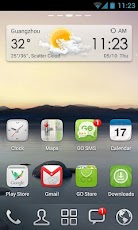
I then remembered that the GO people had their own launcher and I gave it a shot. It’s called GO Launcher EX. This one just worked for me from the start. It’s very similar to LauncherPro so I felt at home with it immediately but it also was snappier, more stable and supported enhanced features I really liked.
You’ll find all manner of supported themes, widgets and really slick effects. For example, the bottom row of icons are all dynamic. You can have whatever you want there and those will stay put even when you move to another home screen. For my setup I have the dialer, Google Maps, the app drawer, GMail and GO SMS Pro. However, each of them supports different swiping actions. What’s that? Well, for the Google Maps icon, I can click it to launch the typical app or I can swipe upwards on it to go directly into navigation mode. For the dialer I can just launch it with a touch or, on an upward swipe it instead loads my contact list. It’s all quite useful and fun. Plus it just works.
Keyboard Apps
Another crucial area is in a user’s choice of keyboard application. This is one area where Android beats the daylights out of the iPhone. With the iPhone you either like the keyboard or you don’t and if you don’t—tough.
There are countless keyboard apps and I’ve gone through quite a few from the most respected to the most unique.
The default Android keyboard isn’t horrible but it’s also nothing special. When it came time to replace my keyboard the top option on the market then was Better Keyboard. I bought it almost immediately and then soon thereafter regretted the decision. While it looked amazing and supported limitless skins I just couldn’t type effectively using it and that’s obviously the most important factor when it comes to a keyboard app. Today it’s not even found on the Android market due to copyright violations.
That led me to Smart Keyboard PRO. This one was my go-to keyboard app for quite a while. It’s very similar to the default keyboard but with added features. It’s quick, uses little memory and is as solid as a tank. However, in the end it felt a bit no-frills when compared to other options I tried. Additionally, I also felt I could still do better when it came to ease of typing.
That desire led me to try SlideIT Keyboard, Swype, TouchPal Keyboard, 8pen and a few others. The first two of these involve a swiping approach to typing where you leave your finger on the keyboard and trace the word you want. For “Hello” you’d put your finger down on the “h” key, slide it to “e” then to “l” and then to “o”. The apps figure out the options and for this one “hello” is the only real choice so it enters that. I liked this for a bit but ultimately opted against it. TouchPal Keyboard is a hybrid. It’s like the “kitchen sink” of keyboard apps. It’s got a bit of everything including standard and swiping entry support but it’s just quirky in use. 8pen is entirely unique involving a totally radical way of typing that just didn’t seem like a good idea to me (if I move to another platform the odds are high it won’t be supported and I’ll really be hung out to dry).

Perfect Keyboard
I then gave the very popular SwiftKey X Keyboard a try and thought I’d found the perfect keyboard. No one beats these guys for predictive text. You can “type” nearly entire messages to contacts with just a few strokes. Plus the app learns your writing style to improve accuracy. As you type it not only predicts the word you want but then the most likely word to follow and it’s amazing to behold. There are just two problems with the app. First, the predictions are so good that, at least for me, you end up stuttering your typing continually looking for the right next word. You type a single letter and look up. Nope, not there yet. So then you type another letter and look up at the list again. Still not there? Repeat. Thus, an approach meant to radically speed things up actually slowed me to a crawl. Second, I find the layout of the keyboard very counter-productive to speedy typing. I’m constantly hitting the wrong keys with it. Those who adapt love it. I keep trying it from time-to-time hoping for improvement but so far it’s still not there for me.
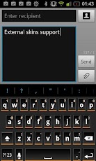
Today I’ve settled into the aptly-named Perfect Keyboard. This one just works for me. It’s highly customizable, supports “shortcuts” (I can type “btw” and it’ll output “By the way” and several input types. I find I type far more accurately with it than any of the others and I’ve never run into a single bug. Kind of hard to dislike results like that.
Security/Antivirus Apps
One area I wish we didn’t need to worry about is the security arena. This covers two main areas and several subsets. Securing your phone generally means adding the ability to protect your phone should you lose it including tracking it down, locking the thief out, wiping the data remotely and more. Most of these apps also offer various levels of backing up your data and nearly all of them offer antivirus support.
The first app I utilized was McAfeeWave Secure. I used it before they were acquired by McAfee and wouldn’t have likely bothered if they were associated with McAfee at the time as McAfee is known far and wide for over-priced, under-performing bloatware that often does more harm than good. This one handles most everything but antivirus support. Note also that the cost is a “lifetime” deal but only for the lifetime of the phone. Once you change phones you need to buy it again and at nearly $20 that’s just too much. What’s more is that I could never, ever, get the locate feature to work and it wasn’t intuitive at all to use.

Lookout
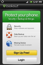
Today I’m using (and liking) Lookout Security & Antivirus. It’s simple to use, has a free version that does 90% of what you want and easily locates my phone. Plus it does everything while hidden in the background. Locking or wiping the phone requires the Premium version which is $30 a year or $3 a month. Expensive but optional. Be sure to create an account on the Lookout website before you lose your phone.I then switched over to avast! Mobile Security. This one also is fully-featured and fairly simple to use but once again, I could never get the locate feature to work. I only found out about this one night when I lost my phone and tried to use this feature. It also continually appears in the notification tray pretty much telling any informed thief that you’ve got this app supposedly monitoring the phone even though they claim you can make it “invisible”. Hardly. I really wanted to like this but just couldn’t.
Calendar Apps
The calendar was one of the biggest surprises for me in adopting the “Google” way of life. I suddenly became more organized and responsive to everyone around me. However, when I moved to an Android phone the default calendar app was just terrible.
I tried a slew of apps and rejected most of them after literally moments of use with them so I’ll just mention the ones that flew above that low bar. The app I used for the longest time is Touch Calendar. This is the app for those users who like to use their fingers to zoom in and out for details. Essentially it provides you a standard view of a calendar and you just slide to where you want to go and pinch-zoom in our out to find the date or level of detail you need. It all works fine but I ultimately found the zooming aspect to be a bit much.
I then tried the most popular calendar app on Android—Jorte Calendar. This is one feature-rich application and is one of the few choices that includes an agenda/task list below the calendar as an option. I can sync with your Google calendar or with a Jorte-provided service. It’s a nice little app but first, I found it god-awful ugly to look at and it’s not as intuitive as it should be.

Business Calendar
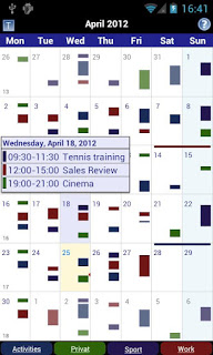
That led me to one of my favorite new apps—Business Calendar. This is one surprisingly effective application. First, it’s amazingly intuitive. Second, the developer is very responsive and open to any input, comment or feature request. You’ll have to try it out to see what I mean with respect to ease of use. You can choose between presenting your entries as “bars” or text. When zoomed out it might be hard to read a bunch of tiny text so you can display representative (in time and duration) bars to give you an idea of the complexity of your day. Want to know what you’re doing that day? Tap the day and a full, graphically appealing pop-up displays the details. Want to know what you’re doing over the next four days? Just swipe your finger over those four days and, presto, you get a complete four-day view. You really meant five days? Just slide a small bar below the display from 4 to 5 and you’re set.
If you’re like me and use several different calendars (mine, work, partner, holidays, sports events, etc.) it can be a pain to de-clutter the screen on demand but not with this app. Just touch the calendar you want to vanish and it’s gone. Long-press a calendar and it stays and all the others vanish from view. Add to this the most graphically pleasing calendar app and it’s all gravy. The only gripe I have with it is dealing with events that cross over midnight. Most apps, including this one, force you to enter a start date and time and then the end date and time get updated to an hour later. If the event is on the same day it’s a breeze to change the duration to another time. However, if it crosses over midnight then you have to change both the date and the time (and click the AM/PM selection). I’d like the option of typing in the start date and time and then entering a duration (one hour, two hours, 90 minutes, etc.) and then let the app do the dirty work. The developer gave me the impression this was likely to happen.
That’s it for now. In the next update of this I’ll touch on various utilities, must-have apps and more.
